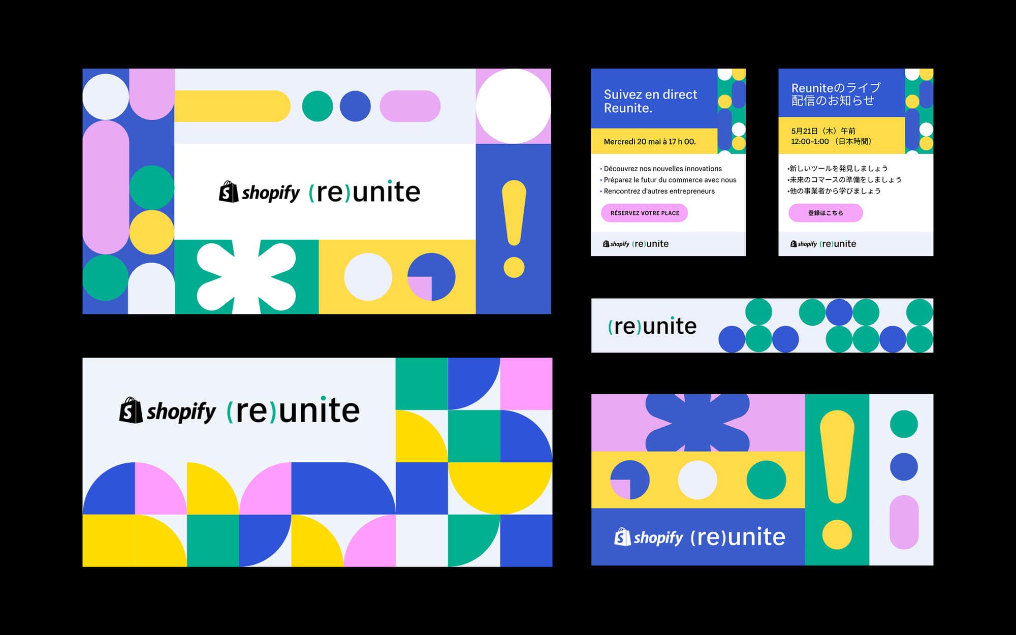
Shopify Reunite
Branding
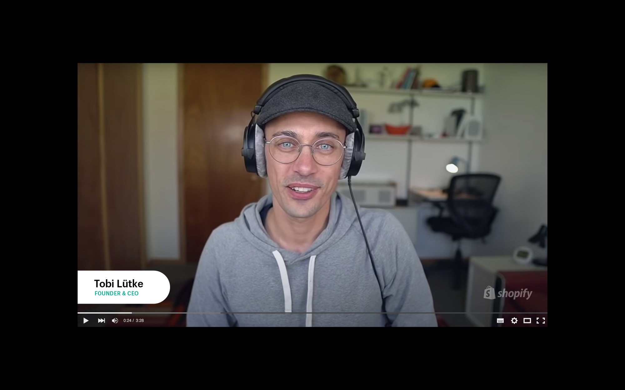
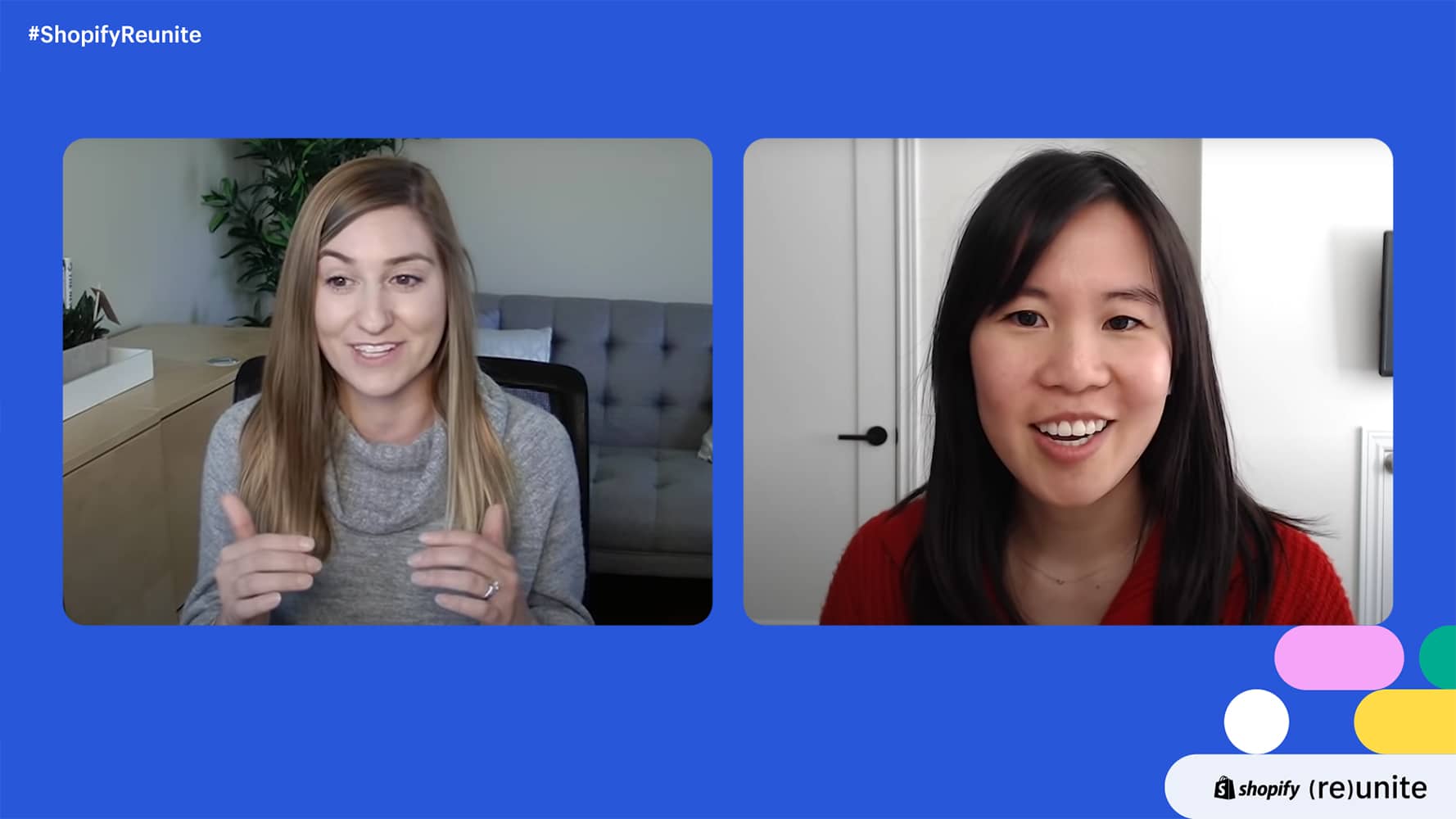
Since 2016, Shopify has hosted Shopify Unite, an annual conference aimed at sharing knowledge and announcing upcoming platform updates. After the global outbreak of Covid-19, Shopify had to cancel its planned Unite conference and very quickly decided to pivot to an online event. Reunite marks the company's first ever livestream conference. The event received incredibly positive feedback, which is remarkable when considering that it was created in a matter of weeks, and watched live by over 100,000 people.
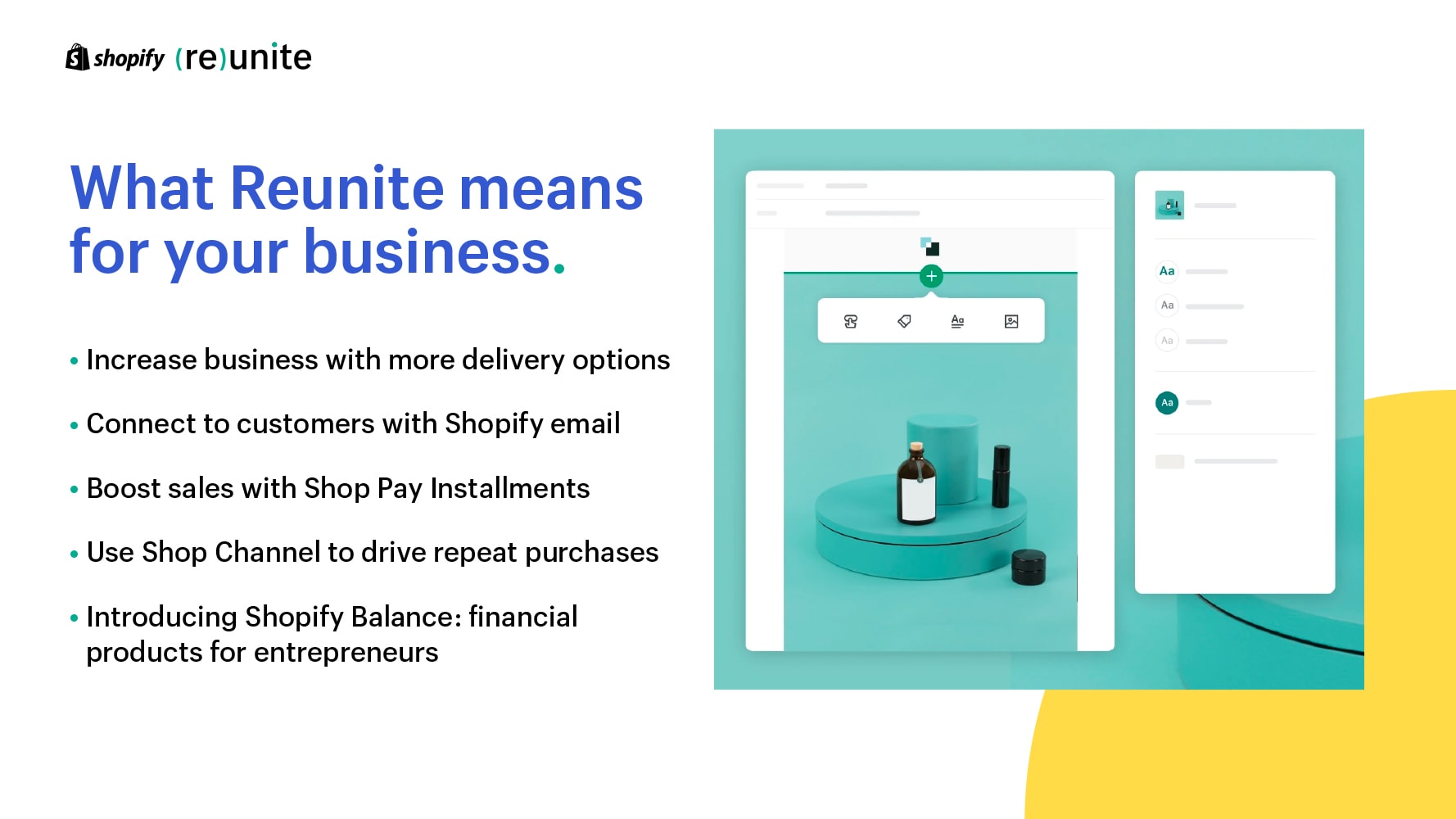
Reunite's goal was to share key information about the future of commerce during an incredibly uncertain time. As such, the branding was designed to feel open, friendly, trustworthy, and energetic. Circles are a subtle nod to the idea of social connection while in physical isolation: individual circles combine in various ways to form all brand elements from the logo, to the patterns, to the graphic elements.
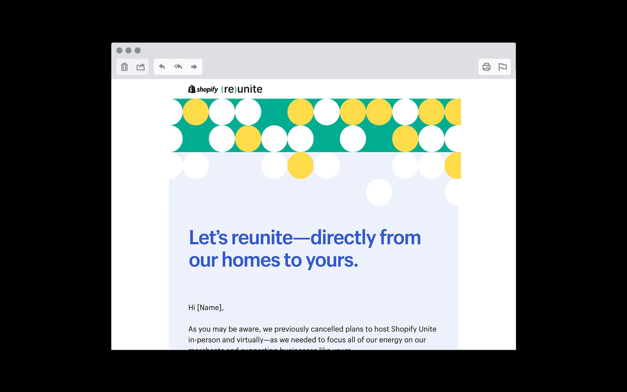
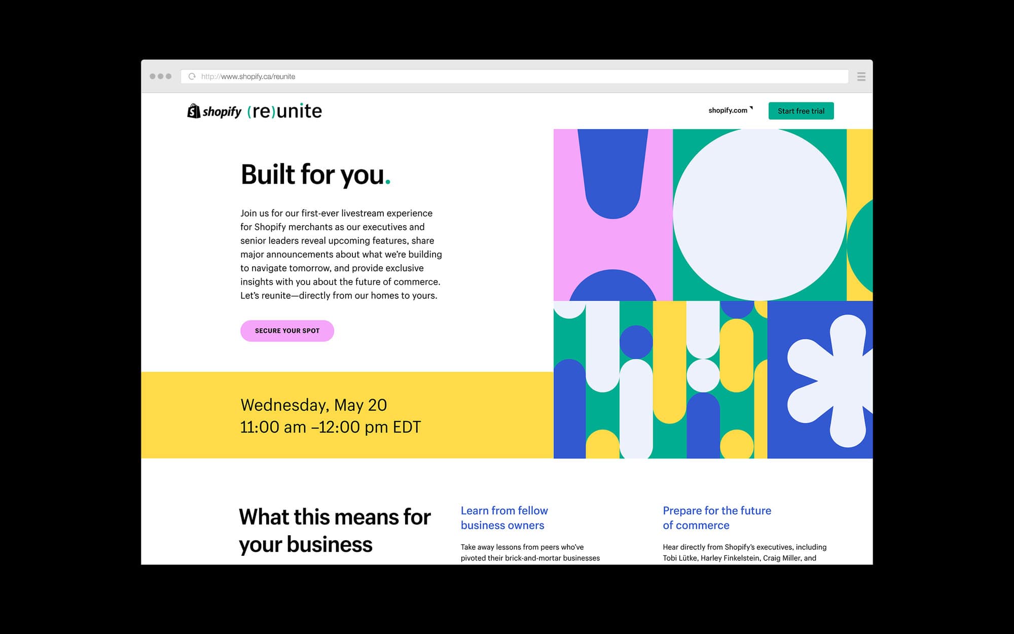
The circle is the primary building block of the brand, and all visual elements from the logo to brand patterns to graphic elements are constructed using circles. Representing social connection while in physical isolation, individual circles combine in various ways to create energetic patterns, shapes, and graphics.
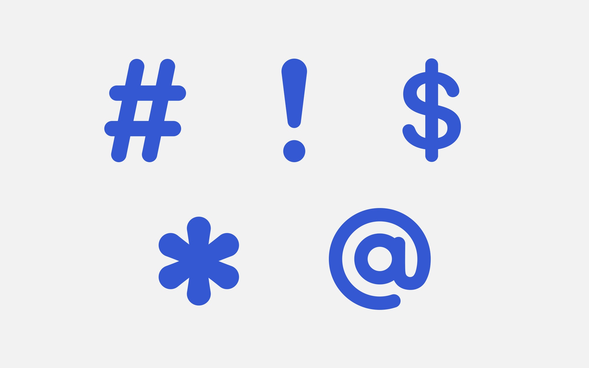
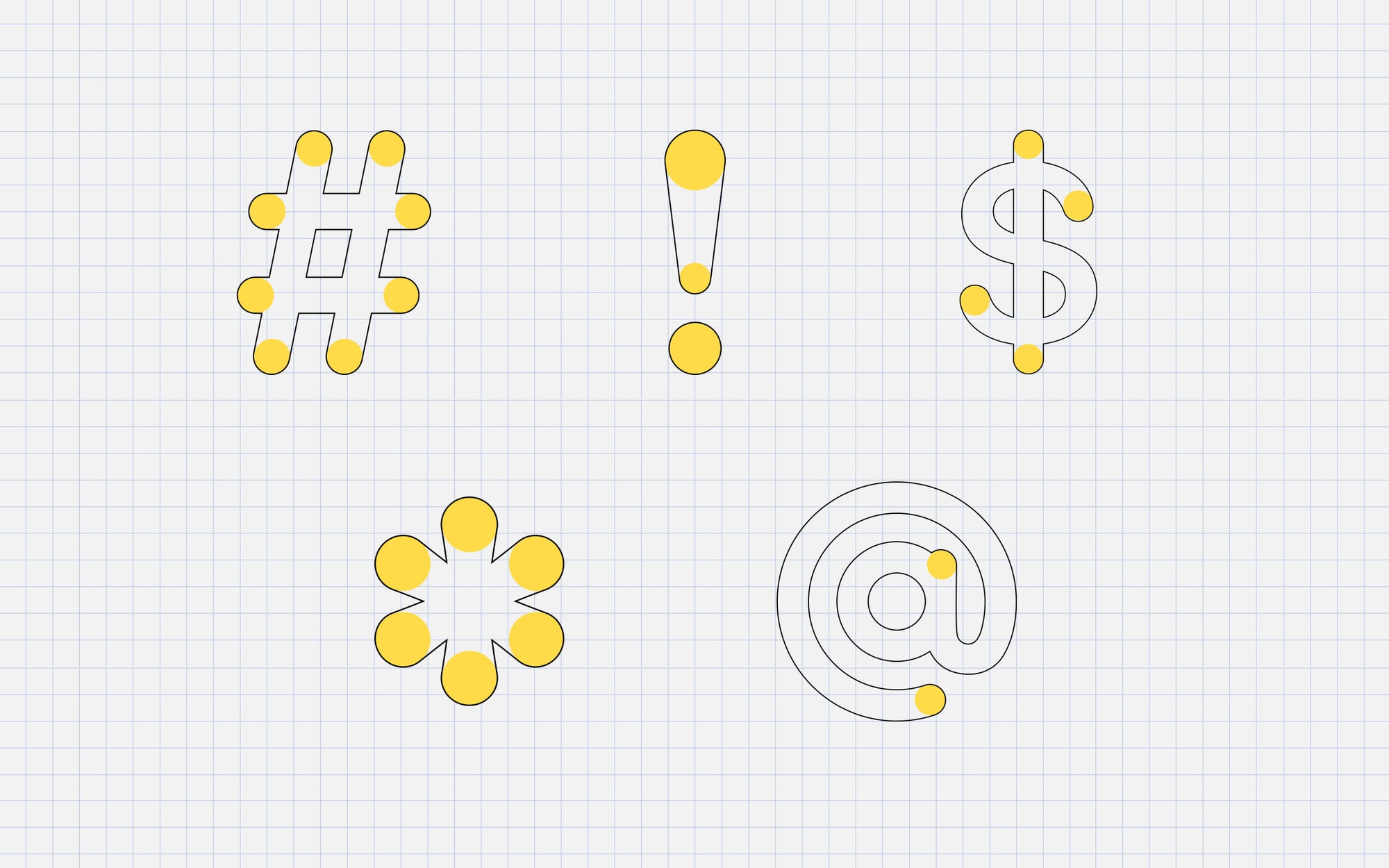
Throughout the brand, symbol and special characters are used as graphic devices to add visual interest and offer a cheeky nod back to the virtual nature of the event. These characters are custom-created for the brand, again using circles as a primary building block.
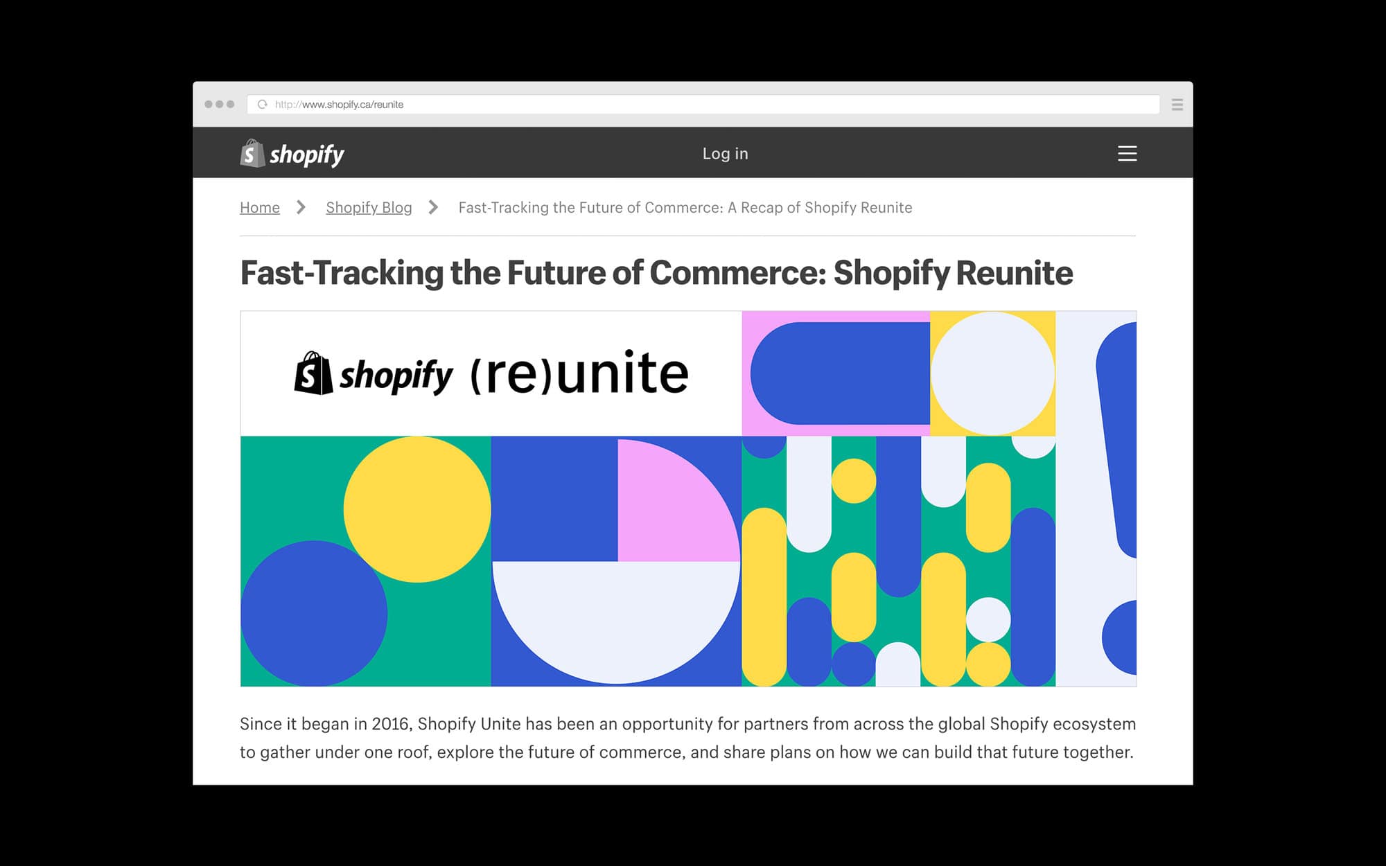
Though I was responsible for creating the Reunite branding (logo and visual language), the assets for this project were designed collaboratively with the rest of my team at Shopify. Assets shown here were designed by myself, Andrée Rouette, Rachel Lin, Syd Selch. Animations were created by Chris Langer.
