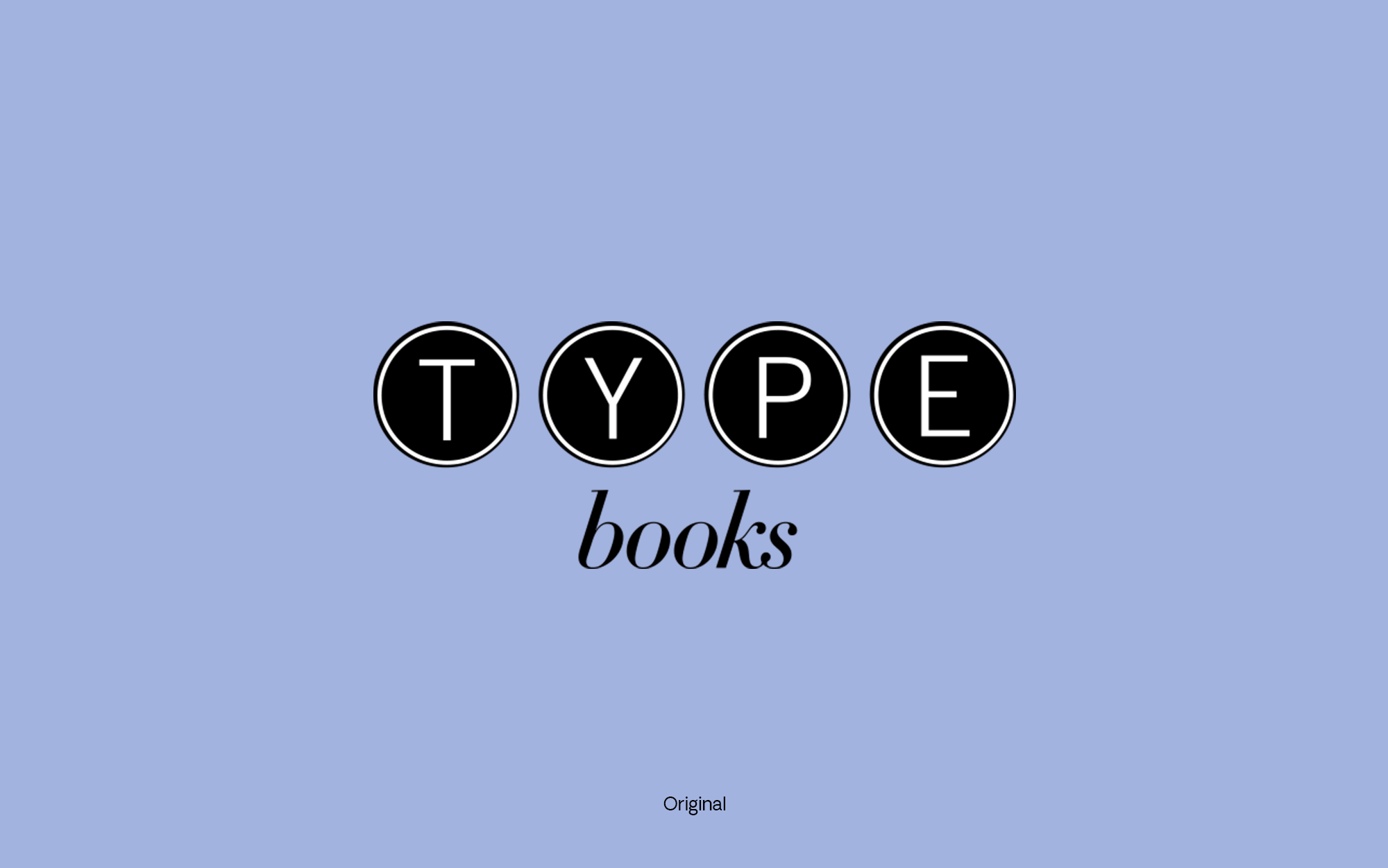
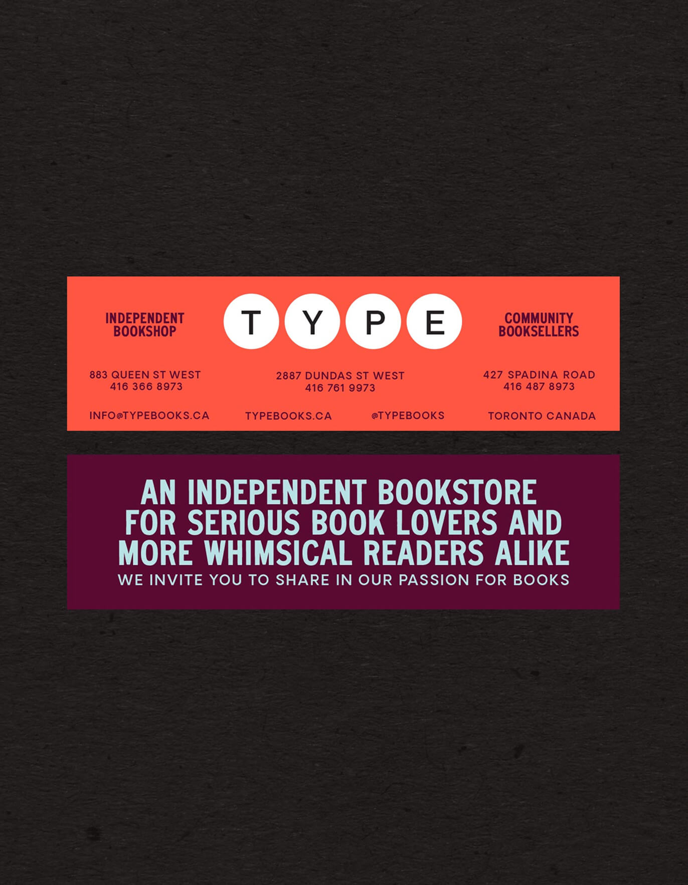
TYPE Books
Branding, Web Design
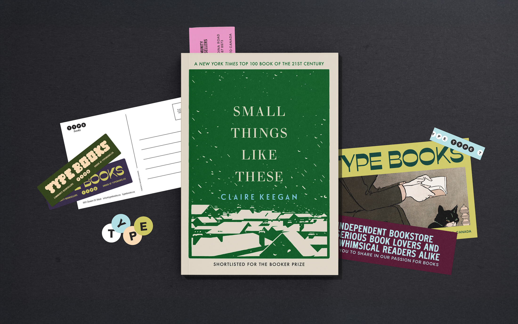
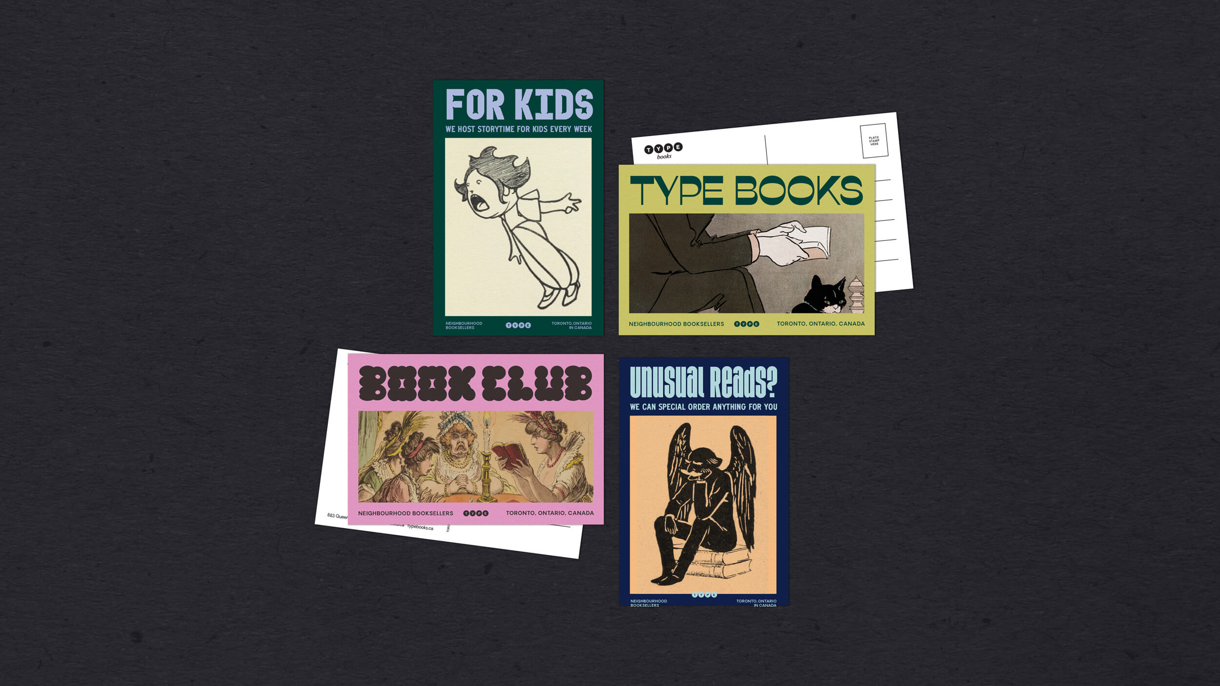
A brand transformation and new digital presence for beloved Toronto indie bookstore, TYPE Books. The refreshed identity evolves the brand while preserving the familiarity that has made TYPE a staple in the city’s literary community.
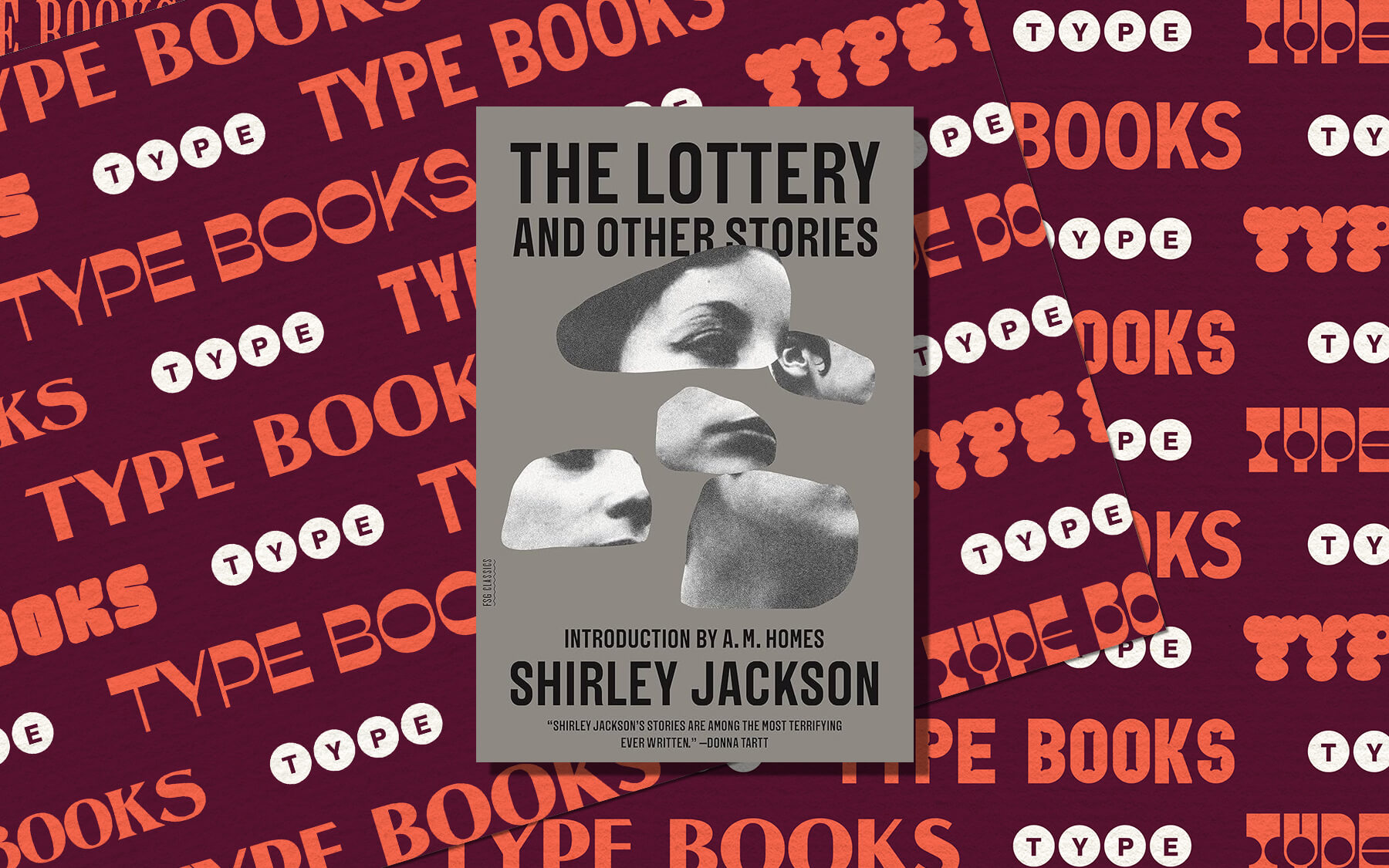
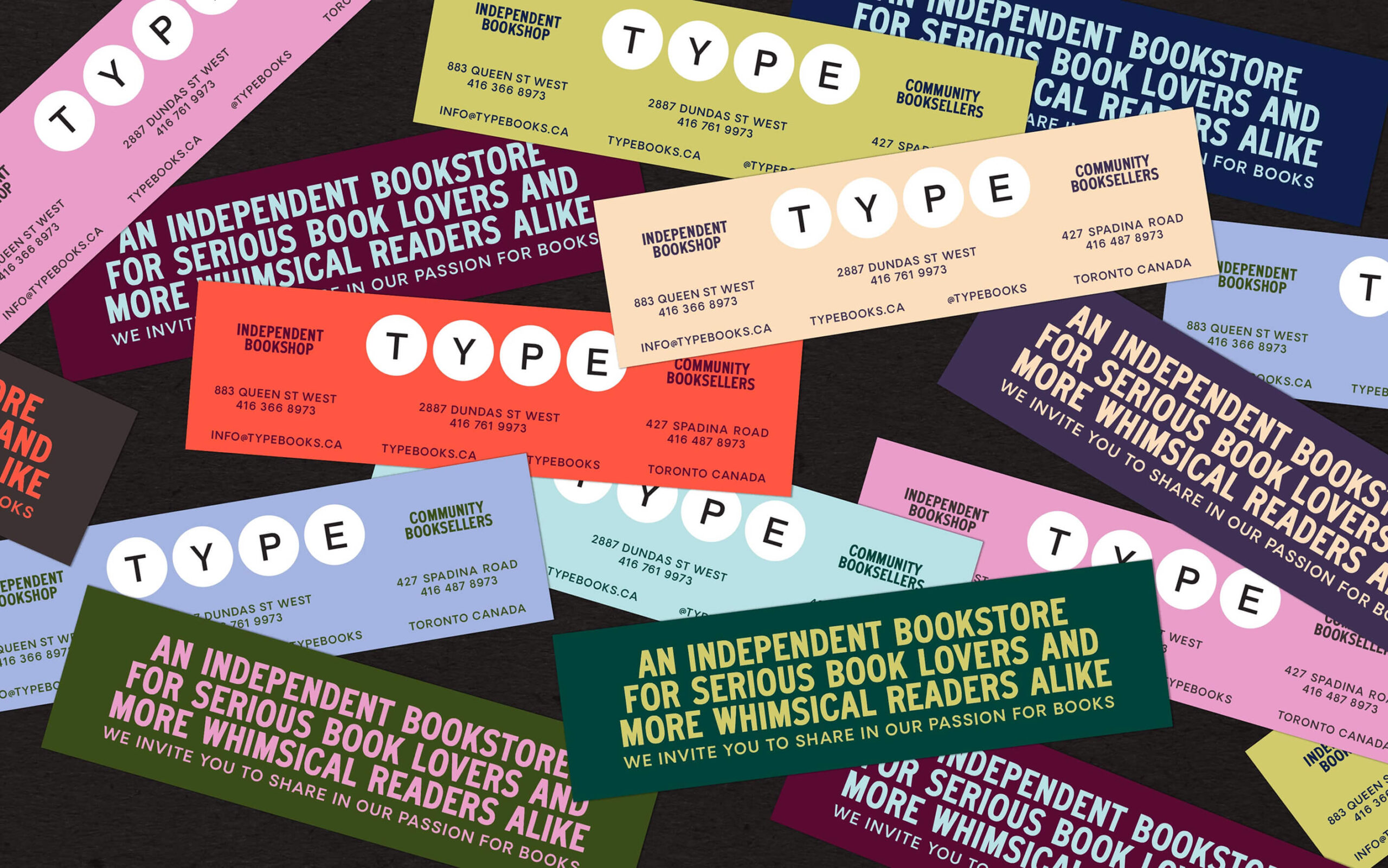
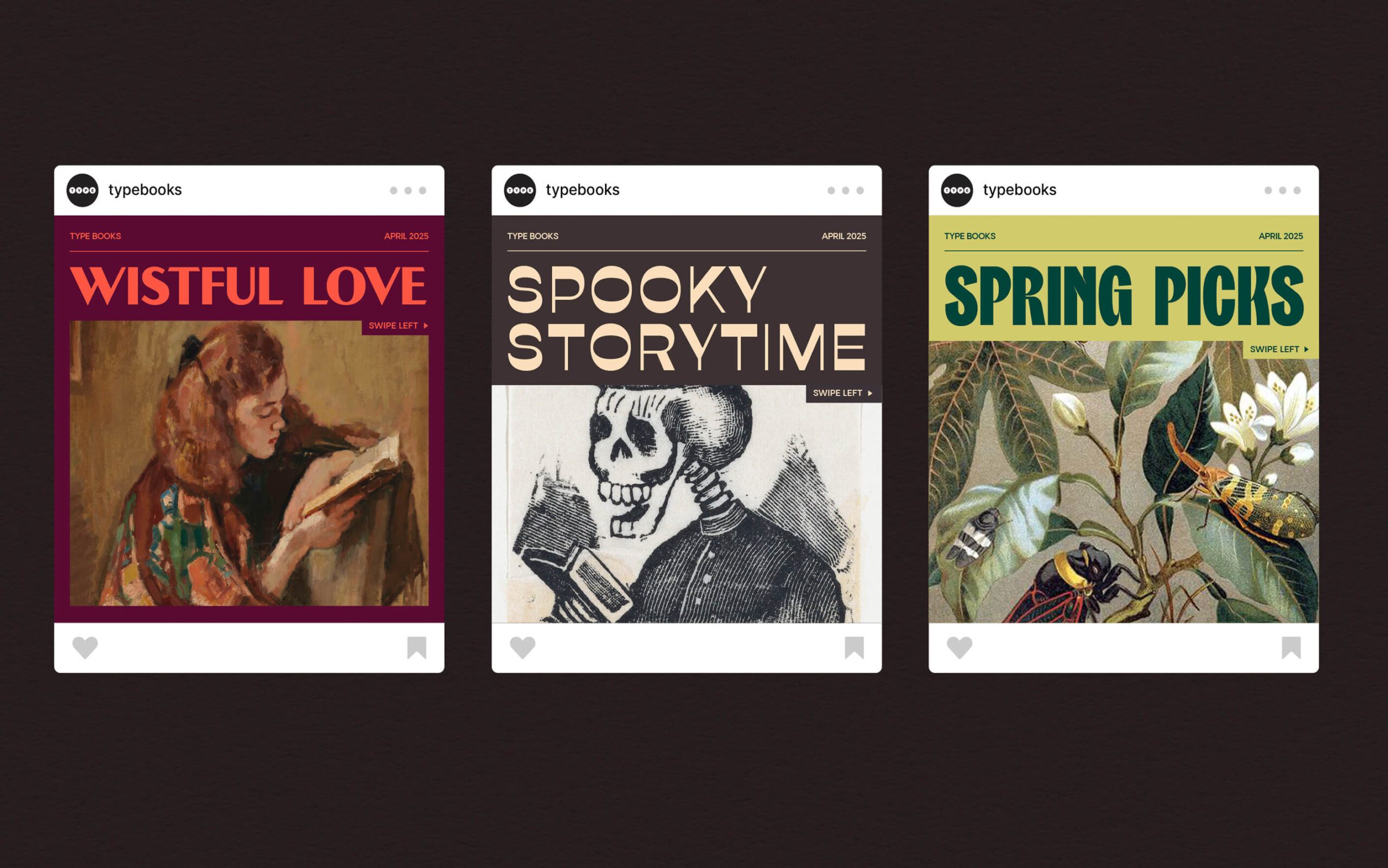
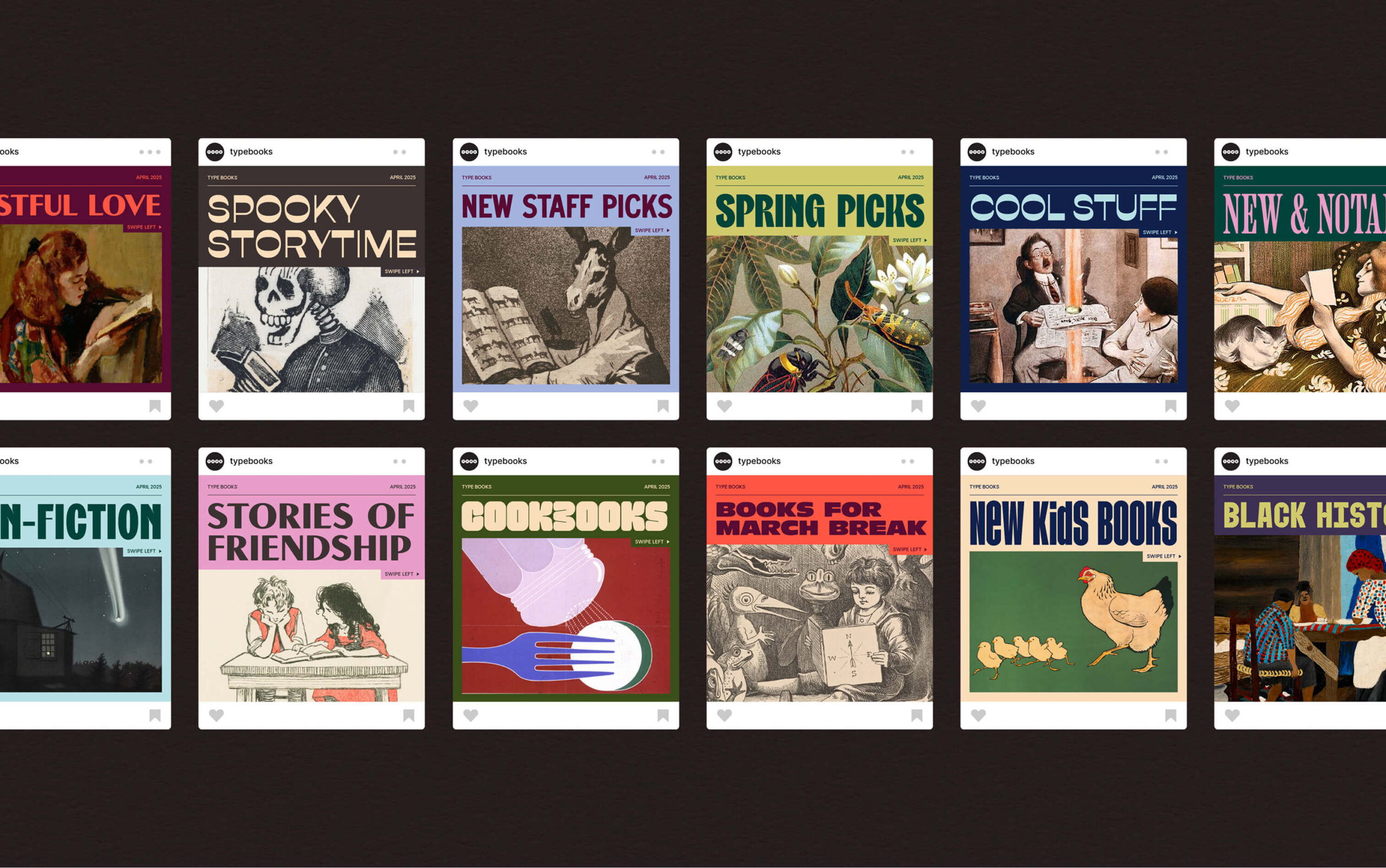
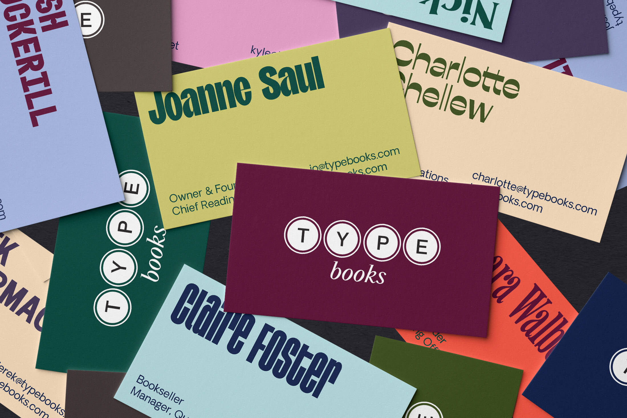
This visual system is built around diversity as a strength. It makes space for a wide range of expression, reflecting the depth and richness of TYPE’s offerings and communities. The result is a brand world that feels generous, layered, and alive: one that invites exploration, signals openness, and celebrates beautiful complexity.
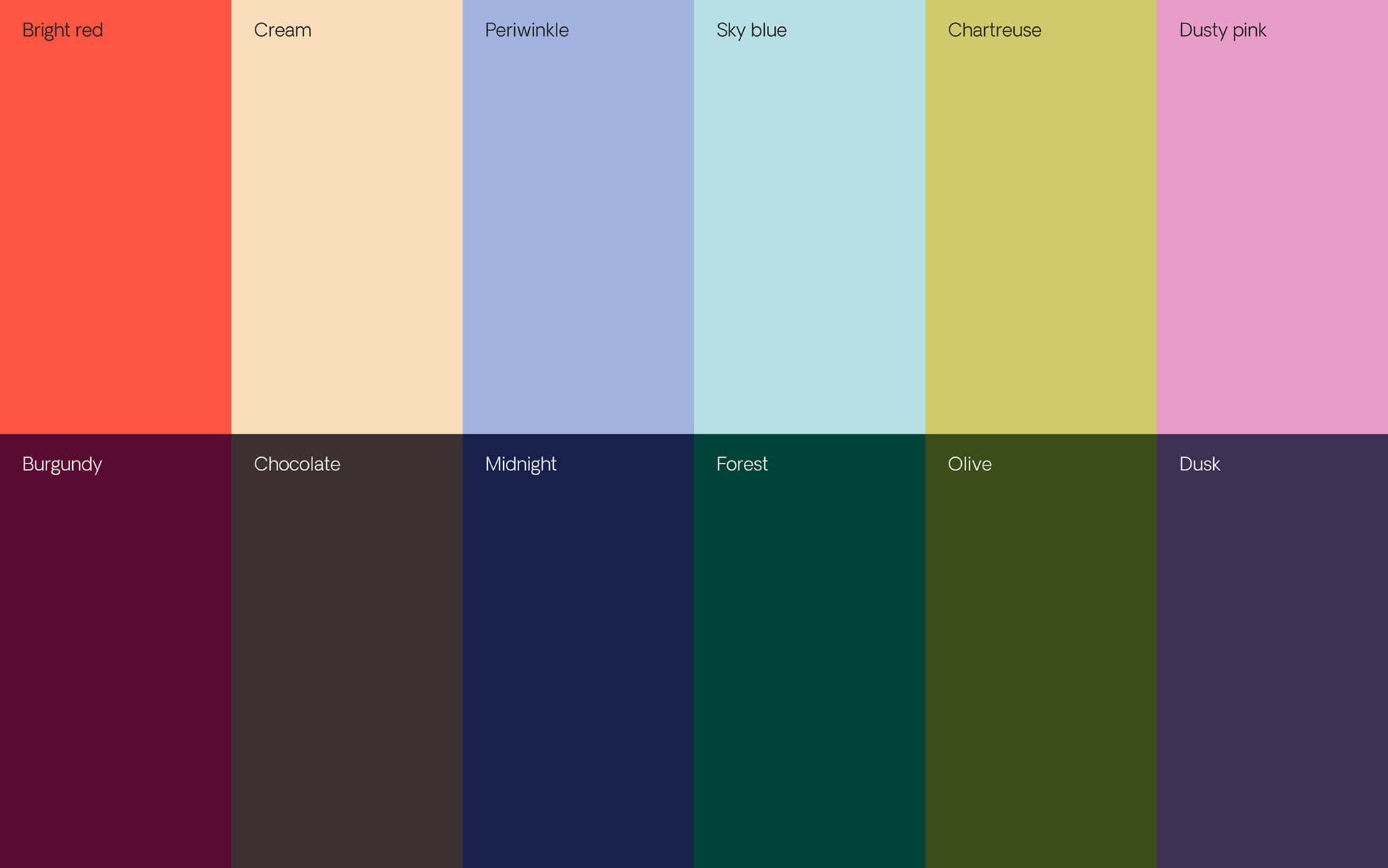
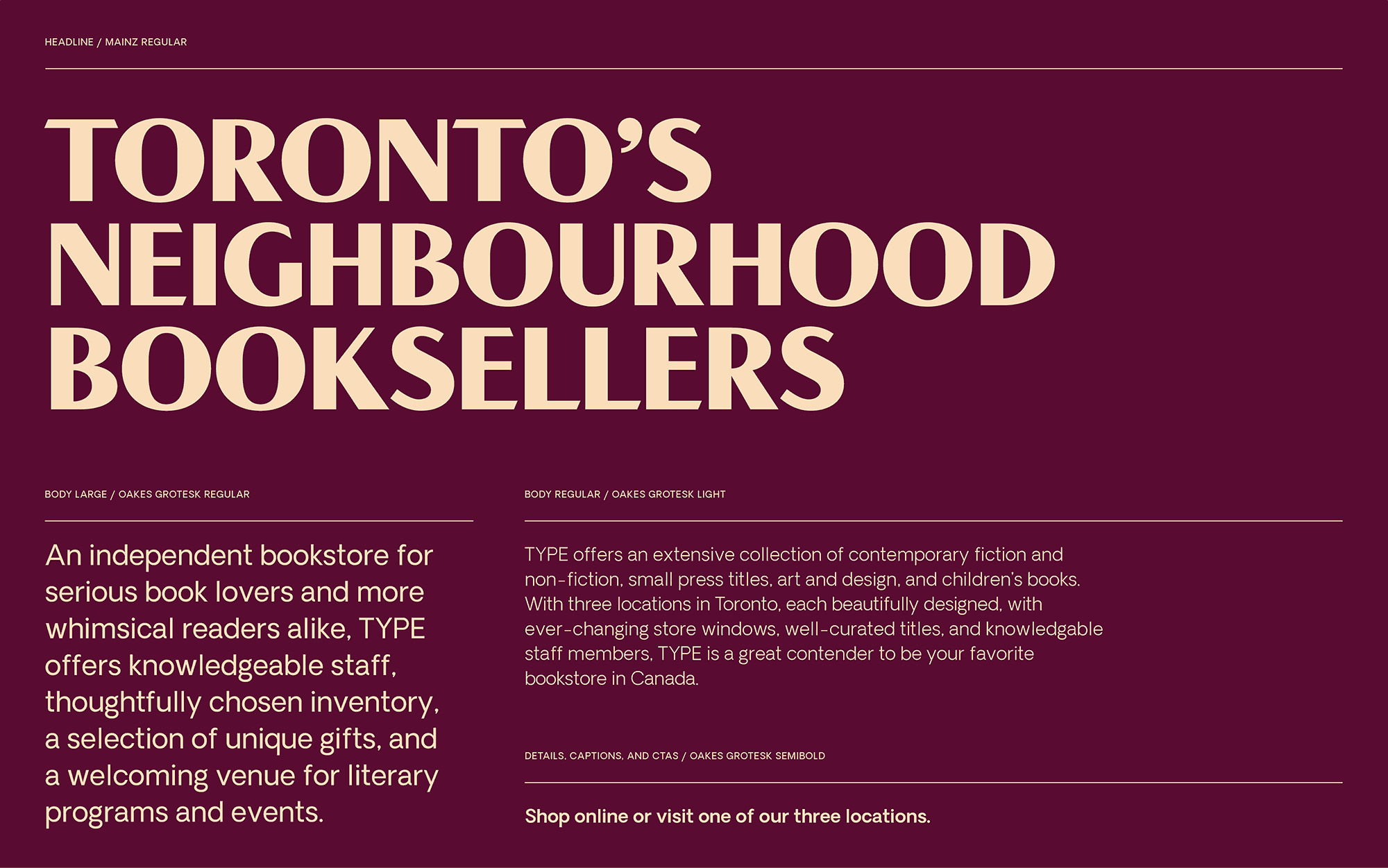
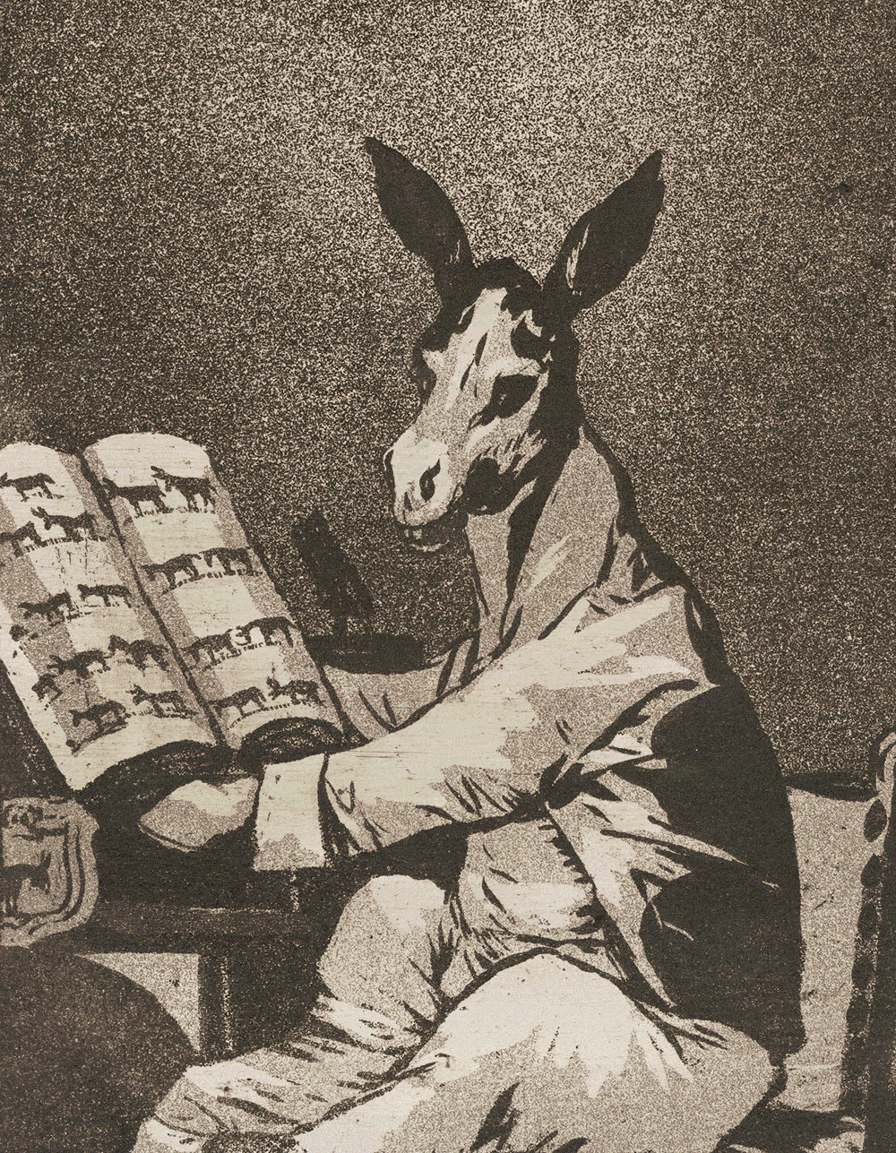
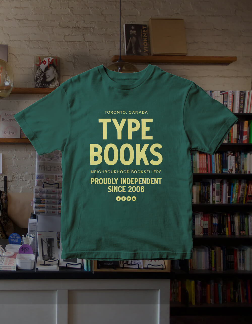
A refined wordmark anchors the brand, while a rotating mix of display typefaces, a vibrant yet slightly retro colour palette, and an expansive library of public domain imagery create a visual language that is both layered and adaptable.Sourced from museum and archive collections, the imagery grounds the brand in the legacy of print, with punchy typography and colour that keep the visual language feeling current.
Rather than striving for uniformity, the system embraces variety. A brand that reflects many voices, while still holding together as one.